Refer and Earn
After identifying key friction points in the referral flow, our redesign led to a 3.3× increase in referral-based loan approval volume driven by the 2.8% rise in referral acceptance.

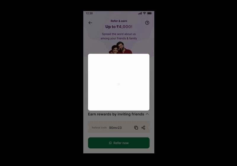
Referral dashboard before (Left) and after (Right)
Business Impact
This project delivered the following value:
A redesigned referral flow led to a 3.35× increase in loan approval volume from referrals, unlocking high-quality growth without additional acquisition spend.
Referral acceptance rates rose by 2.77%, driven by improved value proposition.
By clarifying reward communication, a 1.5× rise in referral loan applicants was observed.
The improved targeting and efficiency of referrals contributed to a ~50% reduction in customer acquisition cost for approved loans from referral users.

Appreciation from CPO
Featured on the company's quarterly and annual digest for tripling revenue and slashing acquisition costs.
The Objective
Under new growth objectives, there was a vision to scale the loan approvals. We identified good opportunities to increase referrals from a UX-driven funnel study to contribute to this objective. We got our green light instantly when we proposed this to our stakeholders.
UX then led the design execution to identify opportunities and redesign the experience for higher acceptance and approval.

Referral funnel study revealing problem impact on the business
Understanding the Problem
From research, we learned that users found the referral process unintuitive and disconnected from a compelling reason to choose Moneyview. Referral givers needed clearer entry points, timely feedback on referral status, and delightful reward cues to stay engaged. On the other hand, receivers needed stronger value assurance—something that told them Moneyview was exactly what they were looking for.

Journey Mapping, Affinity Mapping and Experience Mapping activities to zero in on core user problems and suggest relevant solutions to solve them
Challenges
Navigating this space required cross-functional alignment, data storytelling, and the ability to balance UX execution velocity with integrity, ensuring we GTM fast.
While most stakeholders pushed to widen the top of the funnel, I advocated for focusing on the referral acceptance metric, presenting data-backed evidence that this was the true bottleneck impacting business outcomes.

Sharable referral message after redesign before (Left) and after (Right)
There was pressure to shortcut the UX process—stakeholders came forward with a rough wireframe and expected a polished UI layered on top of a few handpicked use cases. I had to step in, reframe expectations, and bring the conversation back to user needs and validation.
The UX execution had to be marked completed within a tight two-week timeline, which demanded lean research methods, rapid prototyping and a focus on strongly validated design solutions.
Research Phase
Analysed referral funnel performance and principle-based usability patterns to identify key metrics, drop-off points, usability gaps, and missed opportunities—combined findings with competitor study for sharper actionable insights.
Conducted surveys and user interviews to uncover behavioural barriers, motivational triggers, perceived value and misconceptions about the reward experience.
Synthesised findings to derive user problems and crafted a relevant user journey, then aligned stakeholders around core user problems to inform the design direction.
Facilitated collaborative workshops with stakeholders to review research findings and compare their hypotheses-driven design suggestions against research insights.

User Interviews, Existing UX Evaluation and Competitor Study to identify issues and challenges faced by users and how their mental model has been influenced
Design Phase
Defined design priorities and scoped solutions collaboratively, translating research insights into focused problem statements and aligning cross-functional teams on what needed to be solved first.
Sketched early concepts and built low-fidelity wireframes, collaborating with UX writing and UI peers to quickly explore structural solutions and flow variations.
Co-designed high-fidelity prototypes and refined the user interface, focusing on visual clarity, brand consistency, and scalable design components ready for implementation.
Tested and iterated designs based on usability feedback, validating key interactions with users, tracking referral funnel performance post-launch, and proposing a roadmap for ongoing optimisation.
Ensured that stakeholder input was integrated into the UX process while maintaining a user-centered focus for optimal outcomes.

Evolution of solutions from Sketches to Digital Wireframes, and further to Usability Study ready prototype
Summation Phase
Ran moderated and unmoderated usability study sessions, validating whether users could understand the reward mechanics, discover referral prompts intuitively, and complete the flow with minimal guidance.
Synthesised usability testing insights to inform iterative design improvements, refining flow structure based on real user behavior and common patterns.

Referral dashboard improvements before (Left) and after (After) qualitative outcomes from usability testing
Learnings
Always put the concept in the stakeholders’ hands. Stakeholder alignment is not a one-time event. When stakeholders interacted with the referral prototype directly on their phones, it led to a 73% buy-in on the first iteration - far more effective than static reviews or screen shares.
Stakeholder alignment is not a one-time event. Sustained collaboration throughout the sprint — from alignment to shareouts — ensured that decisions weren’t just approved, but understood and backed by context.
Reward winning animation to introduce delight and engagement