MV-GPay Landing Page Redesign
A strategic partner channel entry point redesign that drove a 30.7% increase in partner-sourced leads.
Business Impact
This project delivered the following value:
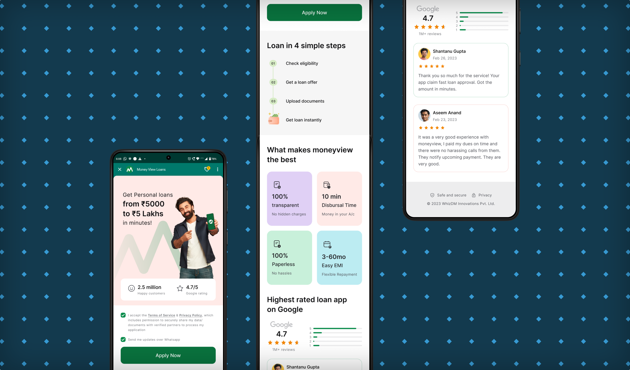
The redesigned GPay funnel landing page led to a 30% + increase in click-through rates, unlocking a high-intent channel for user acquisition.
Enabled faster iteration cycles and reinforced a UX-first experimentation culture within workflows.
The Ask
The GPay and other partner-led funnels were driving traffic, but not converting effectively. The entry-point experience lacked context and failed to build trust or momentum. We saw an opportunity to improve funnel metrics and generate better-quality leads by redesigning

Challenges
The same landing flow had to serve users across a wide spectrum—some arriving with zero context wanting to explore, some comparing Moneyview with other lenders, and others expecting a straight path to loan disbursal. Designing for clarity without overwhelming any segment was one of the key challenges.

Although the GPay funnel contributed modestly to total disbursals, it served as a high-leverage testing ground for features before broader feature rollouts. This meant that we had to move fast, but without disrupting anything that already worked.
Due to partnership limitations, we lacked granular data on how users were progressing through the funnel. With limited visibility, we had to make strategic design bets and trust directional signals to guide our iterations.
Research Phase
Conducted a market landscape review of digital gold platforms and investment behaviours to uncover key mental models, usage patterns, and gaps in the market.
Evaluated product flows, onboarding journeys, trust-building and value-adding techniques across digital gold competitors to identify best practices and usability gaps.
Launched targeted surveys to capture intent, familiarity, and expected behaviours, helping zero in on our ICP.
Conducted interviews with users to understand their perceptions around digital gold - issues, risks, motivations, and hesitations.
Synthesised findings to prioritise core features for launch—striking a balance between must-haves for credibility and low-effort, high-impact add-ons for early traction.

Design Phase
Created wireframes to explore multiple onboarding and transaction flows, focusing on reducing decision fatigue and simplifying intent capture.
Designed modular high-fidelity components in Kanban-style sprints—each iteration focused on one user journey (onboarding, purchase, or repeat buy) to speed up internal validation.
Facilitated alignment workshops with PMs, engineers, and marketing to validate trade-offs, gather input, and ensure feasibility before locking in flows.

Summation Phase
Shared early designs with internal users and pilot audiences to test for clarity, perceived trust, and ease of use—helping eliminate assumptions early.
Paired real-time feedback sessions with rapid design iterations—making regular (almost daily) design refinements based on feedback.

Learnings
Trade-offs are inevitable: We chose a simpler, modular system at launch, knowing it would allow us to scale features without debt.
Sharing user feedback in digestible formats across verticals reduced design misalignment and cut revision cycles by 80%.