Designing for growth and efficiency @moneyview

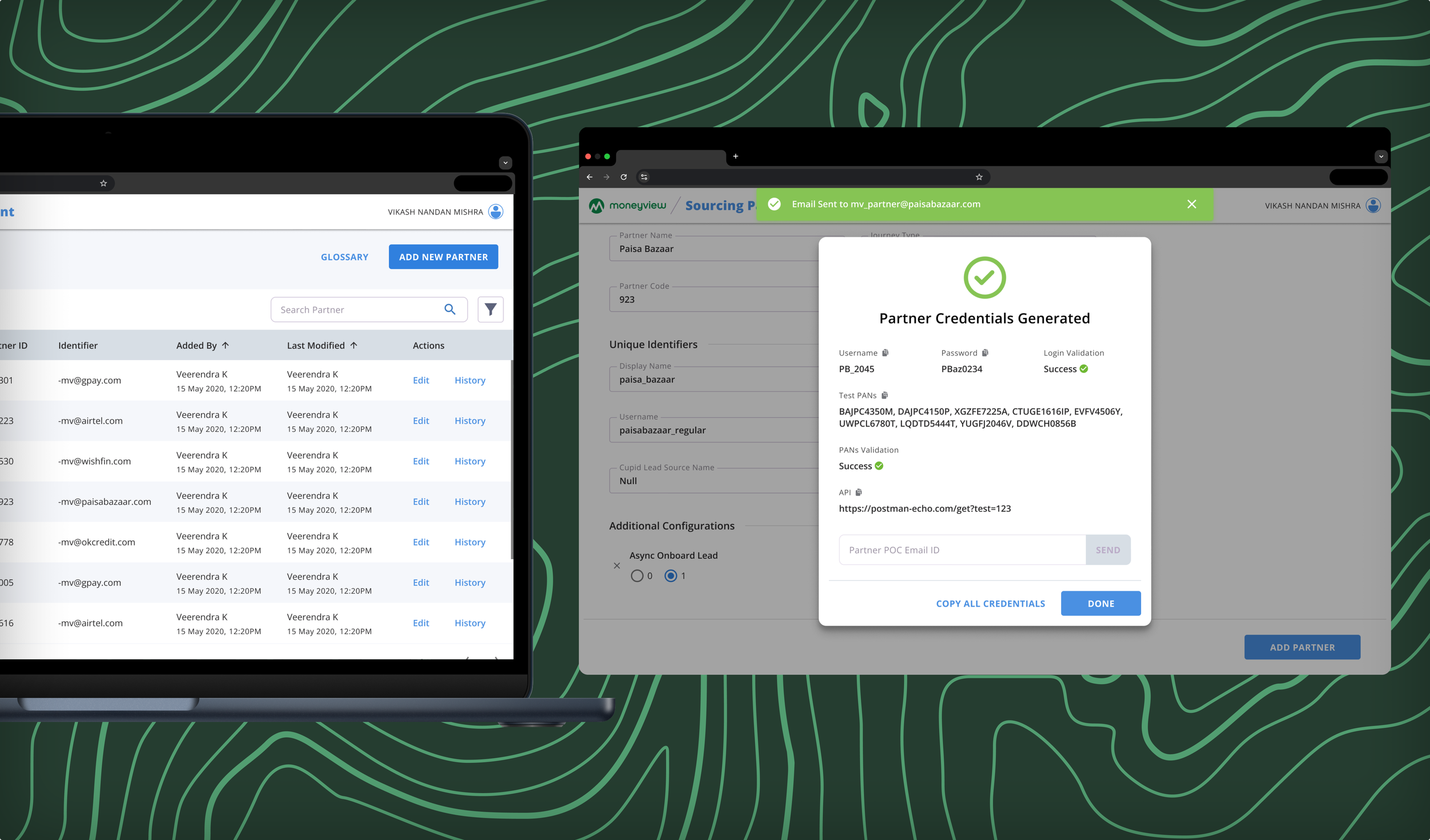
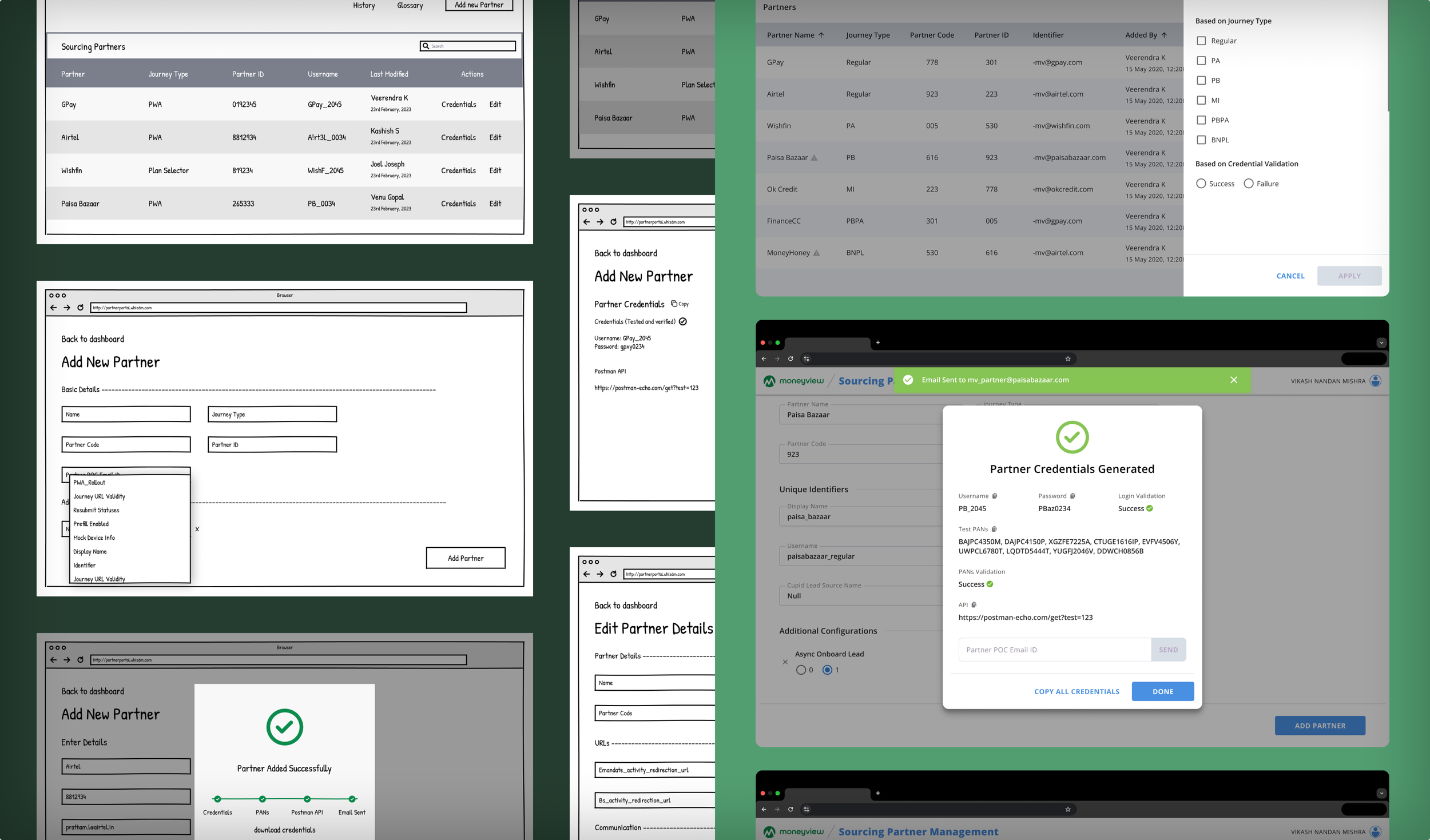
Lead Gen Partner Portal
Lead Gen Partner Portal
Reduced business partner onboarding time by over 90%, freeing weeks of bandwidth for cross-functional teams.
Reduced business partner onboarding time by over 90%, freeing weeks of bandwidth for cross-functional teams.
Business Impact
This project delivered the following value:
Accelerated partner onboarding from 10+ days to less than 1 day.
Drove faster merchant activations, unlocking USD 6-figure revenue streams and ~12% lending funnel growth month-on-month rapidly for the business.
Enabled a unified, intuitive platform that improved partner collaboration and reduced manual errors.
The Objective
Moneyview wanted to enable business partners to onboard quickly, manage their credentials, and collaborate effectively.
The goal was to eliminate manual coordination delays and establish a foundation for scalable and frictionless partnerships for funnel growth.

Understanding the Problem
Lead-generating business partners needed a transparent, intuitive onboarding experience with clear steps, streamlined credential handover, and a single source of truth. They also needed trust and assurance that Moneyview’s platform could support efficient, error-free collaboration right from the start.

Challenges
Onboarding processes spanned the bandwidth of several teams with multiple inconsistencies, causing long delays for integration.

Partners interacted with multiple disconnected systems, leading to an increase in onboarding errors.
Stakeholders were hesitant to adopt new processes, fearing disruption of existing workflows and short-term productivity loss.
Research Phase
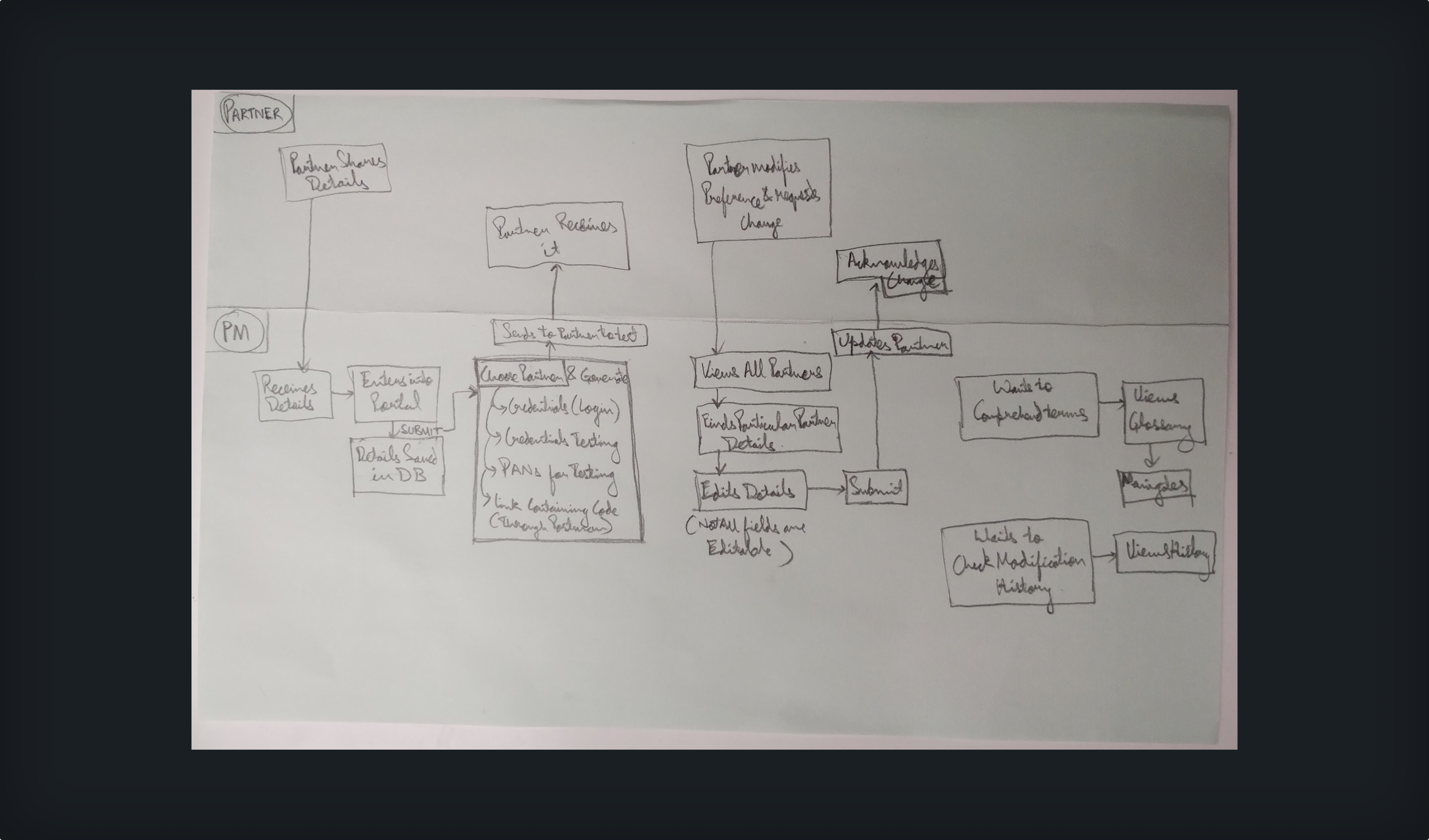
Conducted user interviews with onboarding managers, business partners, and internal teams to map pain points across the partner journey.
Synthesised insights to highlight key pain points, such as redundant and repetitive requests, and a lack of status visibility.
Created pseudo personas for operations managers, stakeholders, and partner representatives, aligning features to specific workflows and expectations.
Mapped the current partner onboarding journey to identify inefficiencies and dependencies.
Design Phase
Redesigned the workflow for a streamlined, guided experience that proactively reduced partner-side drop-offs.
Built early wireframes showcasing credential management, real-time onboarding progress, and actionable next steps.
Iterated into high-fidelity prototypes incorporating data-driven content, micro-interactions, and error prevention patterns.
Secured alignment and approvals from key product, engineering, and business stakeholders by demonstrating potential impact on onboarding time and downstream business metrics.
Learnings
Early collaboration wins trust: Frequent stakeholder check-ins minimised late-stage surprises, accelerated development, and strengthened relationships with business teams.
Clarity multiplies speed: Providing clear onboarding steps and live status updates not only improved partner confidence but also motivated internal teams.

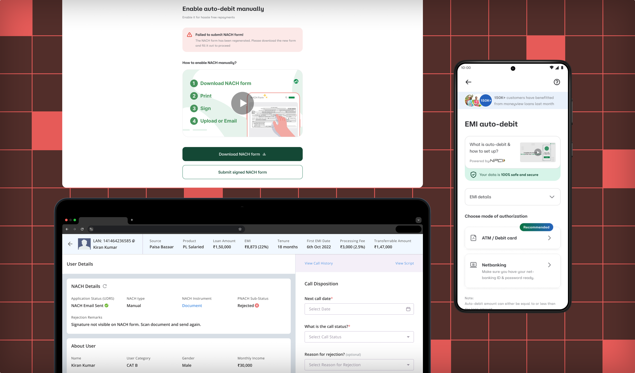
Auto-Debit Setup
Auto-Debit Setup
CRM redesign reduced on-call support time by 39%, freeing up operations teams and improving customer-facing conversions.
CRM redesign reduced on-call support time by 39%, freeing up operations teams and improving customer-facing conversions.
Business Impact
This project delivered the following value:
Reduced customer on-call auto-debit support time by 39%, freeing up bandwidth for cross-functional teams.
Increased auto-debit conversions by 13% by streamlining internal CRM tools and simplifying the customer-facing setup flow.
Enhanced internal workflows, reducing friction for support agents and accelerating issue resolution.
The Objective
Moneyview wanted to improve conversion at high-intent steps, and customers signing the auto-debit stage was one of them. Both the internal CRM used by support agents and the customer-facing setup flow—to reduce friction in auto-debit activation.
The goal was to drive higher conversion rates and reduce dependence on support calls by making processes more intuitive for agents and users alike.
We didn’t want to strip the users of support, but ease their mental model to adopt, so we executed the project in a phase-wise approach.

Understanding the Problem
Support agents needed a tool with relevant customer information to connect with customers and convert them by making them setup auto-debit setups.
While over the long term, customers needed a clear, intuitive flow that enabled them to set up auto-debits quickly and confidently, without needing agent assistance.

Challenges
The Existing CRM tool flooded agents with a plethora of information, mostly redundant. Because of this, agents were forced to develop a mental model of repetitive manual steps, increasing call duration and reducing efficiency.

Customers struggled to complete the auto-debit activation independently because of confusion, lack of clarity and some technical constraints, leading to increased call volumes and reduced conversions.
Integrating improvements into the current system from one side is achievable, but signing auto-debit mandates is on a third-party platform. So, partner-side improvements were necessary to eliminate disruptions to existing functionalities that posed significant design and technical challenges.
Research Phase
Shadowed support agents through their workflows to understand pain points and logged call durations.
Studied customer support tickets to identify customer comments and issues.
Surveyed customers to identify setup issues and reasons for drop-offs.
Mapped task flows and user journeys to surface and resolve inefficiencies and ambiguous interaction points.
Developed agent and customer personas with a focus on motivations, blockers, and constraints.

Design Phase
Phase 1:
Sketched out revised CRM screens for agents.
Designed prototypes with improved information architecture, hierarchy and design to reduce cognitive load.
Facilitated alignment sessions with product, engineering, and operations teams to validate feasibility and prioritise solutions.
Studied and captured feedback from agents through a task-based unmoderated usability test.
Phase 2:
Created low-fidelity wireframes for a simplified auto-debit setup flow for customers.
Prototyped solutions with improved learning experiences to educate and assure users.
Continued prototyping to address technical constraints while keeping the user experience at the forefront.
Monitored interactions and funnel health, measuring completion time, error rates, and support call reductions post-launch and drew up a plan for iterative improvements.

Learnings
Improving agent efficiency had a direct, measurable impact on customer success metrics.
Early buy-in from operations and support teams enabled faster rollout and smoother transitions.

MV-GPay Landing Page Redesign
MV-GPay Landing Page Redesign
A strategic partner channel entry point redesign that drove a 30.7% increase in partner-sourced leads.
A strategic partner channel entry point redesign that drove a 30.7% increase in partner-sourced leads.
Business Impact
This project delivered the following value:
The redesigned GPay funnel landing page led to a 30% + increase in click-through rates, unlocking a high-intent channel for user acquisition.
Enabled faster iteration cycles and reinforced a UX-first experimentation culture within workflows.
The Ask
The GPay and other partner-led funnels were driving traffic, but not converting effectively. The entry-point experience lacked context and failed to build trust or momentum. We saw an opportunity to improve funnel metrics and generate better-quality leads by redesigning
Challenges
The same landing flow had to serve users across a wide spectrum—some arriving with zero context wanting to explore, some comparing Moneyview with other lenders, and others expecting a straight path to loan disbursal. Designing for clarity without overwhelming any segment was one of the key challenges.
Although the GPay funnel contributed modestly to total disbursals, it served as a high-leverage testing ground for features before broader feature rollouts. This meant that we had to move fast, but without disrupting anything that already worked.
Due to partnership limitations, we lacked granular data on how users were progressing through the funnel. With limited visibility, we had to make strategic design bets and trust directional signals to guide our iterations.
Research Phase
Conducted a market landscape review of digital gold platforms and investment behaviours to uncover key mental models, usage patterns, and gaps in the market.
Evaluated product flows, onboarding journeys, trust-building and value-adding techniques across digital gold competitors to identify best practices and usability gaps.
Launched targeted surveys to capture intent, familiarity, and expected behaviours, helping zero in on our ICP.
Conducted interviews with users to understand their perceptions around digital gold - issues, risks, motivations, and hesitations.
Synthesised findings to prioritise core features for launch—striking a balance between must-haves for credibility and low-effort, high-impact add-ons for early traction.
Design Phase
Created wireframes to explore multiple onboarding and transaction flows, focusing on reducing decision fatigue and simplifying intent capture.
Designed modular high-fidelity components in Kanban-style sprints—each iteration focused on one user journey (onboarding, purchase, or repeat buy) to speed up internal validation.
Facilitated alignment workshops with PMs, engineers, and marketing to validate trade-offs, gather input, and ensure feasibility before locking in flows.
Summation Phase
Shared early designs with internal users and pilot audiences to test for clarity, perceived trust, and ease of use—helping eliminate assumptions early.
Paired real-time feedback sessions with rapid design iterations—making regular (almost daily) design refinements based on feedback.
Learnings
Trade-offs are inevitable: We chose a simpler, modular system at launch, knowing it would allow us to scale features without debt.
Sharing user feedback in digestible formats across verticals reduced design misalignment and cut revision cycles by 80%.

Mcoins—Moneyview Rewards
Mcoins—Moneyview Rewards
Launched a gamified rewards ecosystem (Mcoins) that reached 10 million coins rewarded within weeks of launch and boosted cross-product adoption.
Launched a gamified rewards ecosystem (Mcoins) that reached 10 million coins rewarded within weeks of launch and boosted cross-product adoption by 7%.

Business Impact
This project delivered the following value:
Drove cross-product adoption and boosted engagement across digital gold purchases and UPI transactions through streak-based design interventions.
Introduced a task-based rewards strategy and value-linked redemption logic that helped lower acquisition costs for other products, making Mcoins a source for scaling product metrics.
Laid the groundwork for rewards scalability, long-term engagement, retention and rewards-based gamification strategy.

Loyalty rewards
Featured on the quarterly digest for reaching this milestone and increasing cross-product adoption within weeks.
The Objective
Introduce Moneyview’s new reward structure and build a UX foundation for this initiative, "Mcoins", that could seamlessly incentivise user behaviours like cross-product conversion, and on-time payments, while aligning tightly with business growth and user engagement goals.
The Problem
Users primarily interacted with Moneyview for transactional needs, not emotional connection. In the competitive Indian fintech landscape, this left us vulnerable to higher bounce rates. To build enduring loyalty, we needed to move beyond feature parity and create a system of reciprocity, where users felt rewarded for long-term engagement. Mcoins was envisioned as a way to tie everyday usage to meaningful rewards, reinforcing habit loops and fostering brand affinity through value-backed recognition.

Challenges
A key challenge was defining a clear and motivating value proposition for Mcoins. Users had to perceive the monetary worth of the reward as worth the effort—striking the right balance between effort and reward was essential to building sustainable engagement.

There was a strong push to restrict redemption visibility in order to force more engagement. Instead, we aligned the team around transparency as a design principle, and used concept testing and pilot experiments to show that bottlenecking redemption introduced dark pattern risks.

While delight was a UX objective, attempts to include moments of joy and delight (through visual polish, microinteractions, and gamified feedback) met internal resistance due to timeline concerns and the perceived lack of a measurable ROI. We had to make a case that not everything impactful is immediately quantifiable.
The Mcoin-based rewards onboarding
Research Phase
Benchmarked reward systems and patterns across fintech and non-fintech products to surface best practices in designing rewards, reward fatigue mitigation, and redemption psychology.
Mapped the end-to-end reward journey—from task discovery to reward redemption—through the lens of user motivation and product intent. This made friction points and emotional drop-offs visible across surfaces and devices.
Visualised scenarios of how different user types would engage with the rewards system. These storyboards were instrumental in building narratives for stitching the designs together, cross-product stakeholder empathy and aligning the team around specific narratives (e.g., casual saver, aspirational gold redeemer, etc).
Deployed structured surveys at multiple phases—pre-concept, mid-design, and post-launch— and further tested concepts to validate assumptions, rank preferences, and gauge response to perceived value and redemption friction.

Design Phase
Before jumping into UI, we explored how users might interpret a reward system within a credit-focused app. This meant defining Mcoins, their meaning, and how they behave. The goal was to amalgamate delight and utility in a mental model that felt intuitive and easy to learn, without requiring a dedicated tutorial or onboarding flow.
Sketched reward journeys with emphasis on hierarchy, interaction patterns, and emotion. These early frames included raw animation markers and placeholders for delight indicators (like burst effects or “the classic confetti”) to communicate intent early on.
Converted sketches into tappable prototypes to simulate basic task-reward cycles. These were used for quick concept testing, allowing us to evaluate whether users noticed rewards, how they reacted, and what they understood. The visual language for delight was refined based on feedback from these tests before investing in full design.
Co-designed with our UX Writer, UI designer and animator to co-create pixel-level interactions with clear messaging—celebratory events, refining animation concepts, and microinteractions in the redemption journey. This ensured consistency while giving us the tools to evoke a subtle sense of joy without distracting from core reward-earning tasks.


Make it stand out
Whatever it is, the way you tell your story online can make all the difference.
Learnings
Choosing methodologies based on constraints (timeline, access to resources and circumstances) was key. In fast-moving cycles, tactical feedback collection through concepts and storyboard walkthroughs outperformed deep-dive interviews, allowing us to move forward confidently.
Quick, low-fidelity explorations often carried the most weight. A couple of crude sketches with static visuals and animation cues sparked 60 %+ validation of design decisions. This raw concept testing fostered alignment and unlocked faster buy-in than polished decks. Early sketches acted as catalysts for team momentum.

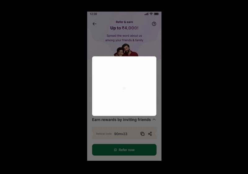
Refer and Earn
Refer and Earn
After identifying key friction points in the referral flow, our redesign led to a 3.3× increase in referral-based loan approval volume driven by the 2.8% rise in referral acceptance.
After identifying key friction points in the referral flow, our redesign led to a 3.3× increase in referral-based loan approval volume driven by the 2.8% rise in referral acceptance.

Referral dashboard before (Left) and after (Right)
Business Impact
This project delivered the following value:
A redesigned referral flow led to a 3.35× increase in loan approval volume from referrals, unlocking high-quality growth without additional acquisition spend.
Referral acceptance rates rose by 2.77%, driven by improved value proposition.
By clarifying reward communication, a 1.5× rise in referral loan applicants was observed.
The improved targeting and efficiency of referrals contributed to a ~50% reduction in customer acquisition cost for approved loans from referral users.

Appreciation from CPO
Featured on the company's quarterly and annual digest for tripling revenue and slashing acquisition costs.
The Objective
Under new growth objectives, there was a vision to scale the loan approvals. We identified good opportunities to increase referrals from a UX-driven funnel study to contribute to this objective. We got our green light instantly when we proposed this to our stakeholders.
UX then led the design execution to identify opportunities and redesign the experience for higher acceptance and approval.

Referral funnel study revealing problem impact on the business
Understanding the Problem
From research, we learned that users found the referral process unintuitive and disconnected from a compelling reason to choose Moneyview. Referral givers needed clearer entry points, timely feedback on referral status, and delightful reward cues to stay engaged. On the other hand, receivers needed stronger value assurance—something that told them Moneyview was exactly what they were looking for.

Journey Mapping, Affinity Mapping and Experience Mapping activities to zero in on core user problems and suggest relevant solutions to solve them
Challenges
Navigating this space required cross-functional alignment, data storytelling, and the ability to balance UX execution velocity with integrity, ensuring we GTM fast.
While most stakeholders pushed to widen the top of the funnel, I advocated for focusing on the referral acceptance metric, presenting data-backed evidence that this was the true bottleneck impacting business outcomes.
Sharable referral message after redesign before (Left) and after (Right)
There was pressure to shortcut the UX process—stakeholders came forward with a rough wireframe and expected a polished UI layered on top of a few handpicked use cases. I had to step in, reframe expectations, and bring the conversation back to user needs and validation.
The UX execution had to be marked completed within a tight two-week timeline, which demanded lean research methods, rapid prototyping and a focus on strongly validated design solutions.
Research Phase
Analysed referral funnel performance and principle-based usability patterns to identify key metrics, drop-off points, usability gaps, and missed opportunities—combined findings with competitor study for sharper actionable insights.
Conducted surveys and user interviews to uncover behavioural barriers, motivational triggers, perceived value and misconceptions about the reward experience.
Synthesised findings to derive user problems and crafted a relevant user journey, then aligned stakeholders around core user problems to inform the design direction.
Facilitated collaborative workshops with stakeholders to review research findings and compare their hypotheses-driven design suggestions against research insights.
User Interviews, Existing UX Evaluation and Competitor Study to identify issues and challenges faced by users and how their mental model has been influenced
Design Phase
Defined design priorities and scoped solutions collaboratively, translating research insights into focused problem statements and aligning cross-functional teams on what needed to be solved first.
Sketched early concepts and built low-fidelity wireframes, collaborating with UX writing and UI peers to quickly explore structural solutions and flow variations.
Co-designed high-fidelity prototypes and refined the user interface, focusing on visual clarity, brand consistency, and scalable design components ready for implementation.
Tested and iterated designs based on usability feedback, validating key interactions with users, tracking referral funnel performance post-launch, and proposing a roadmap for ongoing optimisation.
Ensured that stakeholder input was integrated into the UX process while maintaining a user-centered focus for optimal outcomes.
Evolution of solutions from Sketches to Digital Wireframes, and further to Usability Study ready prototype
Summation Phase
Ran moderated and unmoderated usability study sessions, validating whether users could understand the reward mechanics, discover referral prompts intuitively, and complete the flow with minimal guidance.
Synthesised usability testing insights to inform iterative design improvements, refining flow structure based on real user behavior and common patterns.
Referral dashboard improvements before (Left) and after (After) qualitative outcomes from usability testing
Learnings
Always put the concept in the stakeholders’ hands. Stakeholder alignment is not a one-time event. When stakeholders interacted with the referral prototype directly on their phones, it led to a 73% buy-in on the first iteration - far more effective than static reviews or screen shares.
Stakeholder alignment is not a one-time event. Sustained collaboration throughout the sprint — from alignment to shareouts — ensured that decisions weren’t just approved, but understood and backed by context.
Reward winning animation to introduce delight and engagement

Digital Gold
Digital Gold
A GTM-first, zero-to-one UX execution that drove 50,000+ unique transactions in 3 months, paired with continuous improvement loops to optimize conversion and retention post-launch.
A GTM-first, zero-to-one UX execution that drove 50,000+ unique transactions in 3 months, paired with continuous improvement loops to optimize conversion and retention post-launch.

Digital gold landing page (on the left) and purchase page (on the right)
Business Impact
This project delivered the following value:
Helped scale a new product vertical to an USD 7-figure assets under management, making it one of the best-performing Moneyview offerings after lending.
A redesigned conversion flow increased the average invested value per investor by 22%.
Streamlined onboarding and purchase journeys improved the purchase completion rate by 7.4%.
Repeat purchases grew by 36% after introducing value-driven UX patterns and improving post-purchase flows.
Media feature: Financial Express↗, Business Standard↗, Express Computer↗ and APAC News↗
The Objective
With Moneyview becoming a soonicorn, we set our sights on entering new product verticals - Investing. One of the first was digital gold.
The goal was to launch a first-time investment experience that could attract an organic user base (independent of lending) and keep them engaged across the Moneyview ecosystem.

Market size and identified opportunities from market research
Understanding the Problem
Our research informed us that the proposition to invest felt unfamiliar to many first-time investors. Users needed to understand why investing was a good financial decision and how to make it secure. Without context about long-term benefits, investment intent was low.

Quantitative insight from survey validating market research findings in context to Moneyview’s users
Challenges
Unlike credit products, digital gold required a fresh mental model—users who typically came to Moneyview to borrow money now had to be nudged toward investing for the first time. The challenge was to build trust and make that “ask” feel safe.

Research findings analysed and synthesised - The #1 key highlight being the trust that users have in a physical piece of gold v/s digital gold, which was a key driver in emphasising our partnership with a jewellery store and promoting exchange of digital gold to physical gold
The journey had to be designed to ensure that the product could recover its GTM cost, all while mitigating the risk of entering into a new vertical with no guaranteed traction.

GTM opportunities and gaps, and product positioning identified through SWOT activity with stakeholders
There was early pressure to replicate existing digital gold platforms from competitors to save time. Advocating for user-first design decisions that were grounded in Moneyview’s context was necessary, not just market parity and rolling out “another digital gold product”.

Competitors studied and benchmarked for target audience mental model
Research Phase
Conducted a market landscape review of digital gold platforms and investment behaviours to uncover key mental models, usage patterns, and gaps in the market.
Evaluated product flows, onboarding journeys, trust-building and value-adding techniques across digital gold competitors to identify best practices and usability gaps.
Launched targeted surveys to capture intent, familiarity, and expected behaviours, helping zero in on our ICP.
Conducted interviews with users to understand their perceptions around digital gold - issues, risks, motivations, and hesitations.
Synthesised findings to prioritise core features for launch—striking a balance between must-haves for credibility and low-effort, high-impact add-ons for early traction.

User Flows targetting critical areas - One-time/Systematic investment, First/Repeat investor time, and Selling/Transferring digital gold

Demographic Profiles derived from market study, used for aligning stakeholders and creating survey questions

Proto-personas derived from Demographic Profiles, used for designing features and prioritizing them
Design Phase
Created quick wireframes to explore multiple onboarding and transaction flows, focusing on reducing decision fatigue and simplifying intent capture.
Designed modular high-fidelity components in Kanban-style sprints—each iteration focused on one user journey (onboarding, purchase, or repeat buy) to speed up internal validation.
Facilitated alignment workshops with PMs, engineers, and marketing to validate trade-offs, gather input, and ensure feasibility before locking in flows.

Evolution of Design Concepts into Wireframes, and Wireframes into Hand-off ready UI

Not-so-boring loading screens with animation and reassuring content to retain engagement and reduce bounce rate
Summation Phase
Shared early designs with internal users and pilot audiences to test for clarity, perceived trust, and ease of use—helping eliminate assumptions early.
Paired real-time feedback sessions with rapid design iterations—making regular (almost daily) design refinements based on feedback.

Observing Heatmaps of pilot product interactions, deriving insights and using inferences to drive UX decisions
Additional Features

Feature - Systematic investment plans (starting from low amounts matching purchasing power of ICP, for regular engagement - as frequent as daily)

Feature - Dynamic offers framework (an automated and templatized server-driven offer framework)

Feature - Scalable campaigns and experiments (built on top of the dynamic offer framework for rapid experimenting)
Learnings
The laundry list of features is only going to increase: We chose a simpler, modular system at launch, knowing it would allow us to add and scale features without debt.
Distribute insights to drive convergence: Sharing user feedback in digestible formats across verticals reduced design misalignment and cut revision cycles by 80%.